In this article, I give you tips for making effective business card design.
Despite the fact that you are in a world of more and more digital, the business card on the one hand to give a positive image of his business, and to stay in memory after an appointment because it is often lone of the few tools left to a prospect after an appointment.
The cost of a unique business card design is very variable, it's only around $10 for one business card each.
Order Now
1) The FORMAT
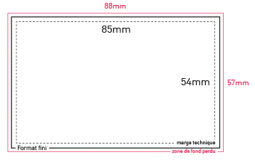
The standard size of a business card is 8.5 cm (85 mm) x 5.4 cm (54 mm).
This format is certainly the most widespread, but especially the most judicious.
This format is certainly the most widespread, but especially the most judicious.
It corresponds to the size of a bank card and will, therefore, be suitable to fit into any wallet.
To avoid :
- A card that is too big will not be kept, it will be folded, lost or thrown because it does not fit in the vast majority of wallets and card cases.
- A business card too small (eg metro ticket format) that can certainly surprise, but sometimes "low cost" in some sectors (eg in finance a "classic" card is preferred).
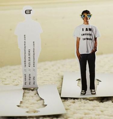
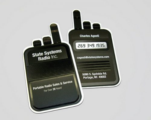
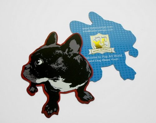
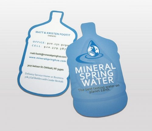
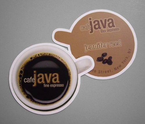
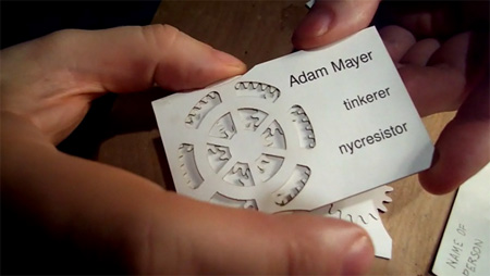
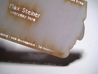
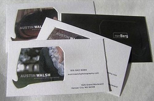
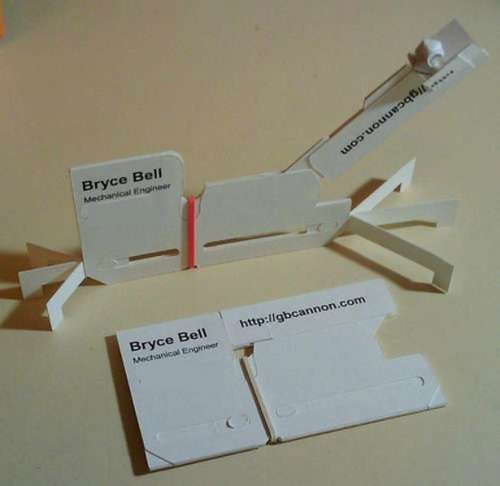
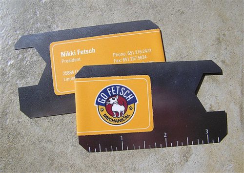
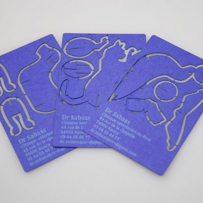
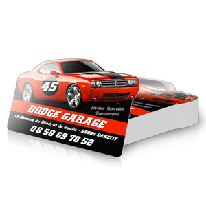
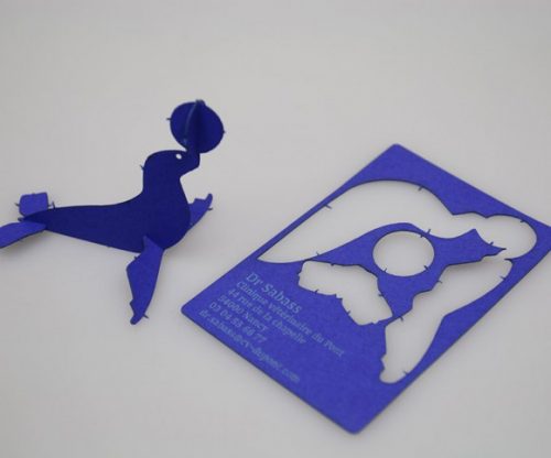
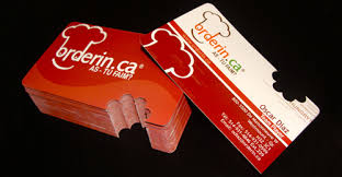
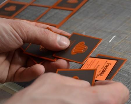
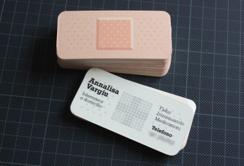
You can also opt for cards for cut-out events, which allow you to have more memorization and leave room for your creativity.
Order Now
Here are some examples of pre-cut cards:
2) The SENS
Vertical or horizontal, the meaning does not matter ...
A horizontal map organizes its information on the left and right parts of it, it is the most common format and the most universal.
A vertical map makes it necessary to arrange its data under each other.
It is a more original format that is out of the ordinary (it was previously more complex to integrate a vertical card in a Rolodex), the disadvantage is that the text is often more compact because the writing space is smaller.
Most maps of our daily life (banking, loyalty, badge ...) being of a horizontal format, it remains the most natural and is a reference.
To avoid :
- Make one side horizontally and one side vertically, which makes it necessary to hold the card in one direction and to reproduce the same message on each side in another form. It is better to use one side for the coordinates, and the other side for a slogan, a logo, a graphic ...
3) PAPER
A quality paper will give a good image of your company, choose a coated paper, shiny or matte having a thickness of 300 grams minimum to ensure a good business card.
For a more institutional activity such as lawyer, physiotherapist, notary ... your choice can move towards a textured paper with a larger gram.
To avoid:
- Low-end papers or too fine.
- The cardboard is slippery to write.
- Printing and cutting "home".
- Low-end papers or too fine.
- The cardboard is slippery to write.
- Printing and cutting "home".
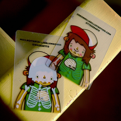
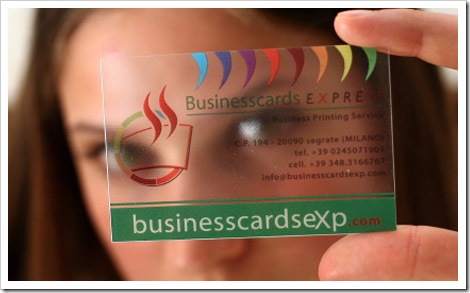
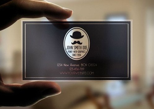
If your activity lends itself to this, you can also choose more luxurious paper (eg 1000 g) for a very cardboard format or even plastic:
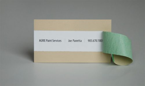
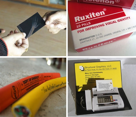
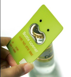
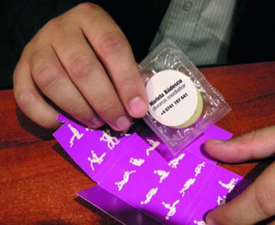
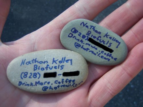
You can even use original materials related to your activity:
Notes:
- If your business cards are very original, you can also use them to launch a communication operation (eg send a sample of your products & your business card via a Press Kit). In this context you can just print a hundred cards with an original design, cutting ... and use more classic cards for your daily use.
- You can also print business cards specifically for events and trade shows. In this context, you can add promotions, discount codes ...
4) FINITIONS
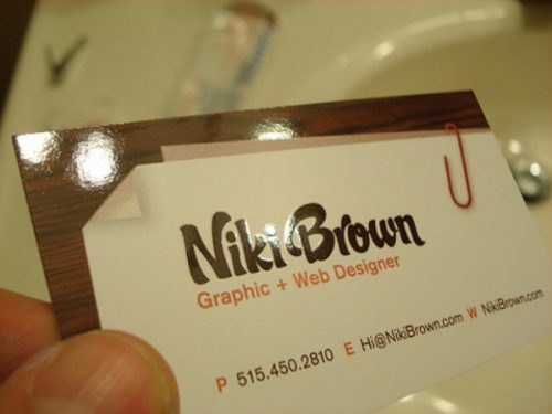
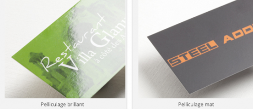
To distinguish yourself from your competitors, you can choose different finishes such as matt or glossy lamination or selective varnish.
The film coating is applied to the entire card thus reinforcing its rigidity.
- If it is dull, the general rendering will be softer, ideal for activities of well-being, health, nature ...
- If it is brilliant, the colors will be bright and vivid.
- If it is dull, the general rendering will be softer, ideal for activities of well-being, health, nature ...
- If it is brilliant, the colors will be bright and vivid.
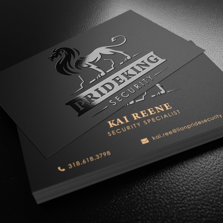
The selective varnish allows you to highlight some key elements of your business card: logo, photo, text ...
Here is an example with some of the mark and the varnish texts:
To avoid :
- If you opt for a laminating, you will not be able to write on your cards anymore! Indeed as the rendering of the card will be "plasticized" with the impossibility of writing pen bic, which is not very practical (especially in a lounge where we often note the information on a business card ).
- Laminating gives a "high-end" look, be careful that it is related to your business.
5) INFORMATION
The information on your business card must answer 4 main questions: who? what? or? how?
- Who? The name of the company, your name (s) and first name (s)
- What? Business activity, your function. If possible describe your "Unique Selling Proposition", ie what your business is different from the others, the main argument that answers the question "Why buy at home rather than at a competitor".
- How? Contact information to contact the company, your direct contact
- Where you are, whether on the web or your physical address
To avoid:
- Too much info, kill the info! Your business card is not an advertising insert, go to the basics.
- The term "manager" is not a function, rather use commercial director, general manager ...
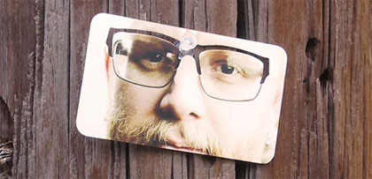
- Put his picture on the business card, unless you are an artist and your face is your product.
- Too much info, kill the info! Your business card is not an advertising insert, go to the basics.
- The term "manager" is not a function, rather use commercial director, general manager ...
- Put his picture on the business card, unless you are an artist and your face is your product.
- Delete unnecessary information (eg fax, landline if you are still on the move, Twitter / Facebook / ... the company because you do not click on a paper map)
- Attention to the terms "at the mode ", like CTO, CMO ... that are not necessarily known to all. Sometimes it is better to add a term more known (eg Marketing Manager ..) in addition to the English term.
6) RIGHT OR RIGHT / Verse?
To answer this question, start by listing the number of information that will appear on the business card.
Recto will be enough to place the information about the company as well as your personal co-ordinates.
It will also leave the possibility to write on the back (Appointment, mobile number ...).
It is important to let the text "breathe" and ventilate for easy reading.
Often we can put on the front the name of the company with the logo and possibly the website and on the back the information about the person. So you have double visibility.
A recto/verso allows to add on the second side additional information:
- the activities of the company
- an access plan
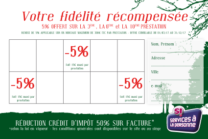
- loyalty
card - appointment card
- schedules
- prices
- etc
- the activities of the company
- an access plan
- loyalty
card - appointment card
- schedules
- prices
- etc
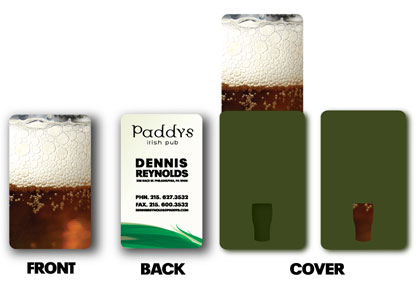
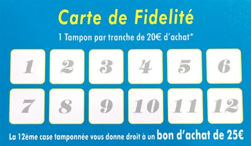
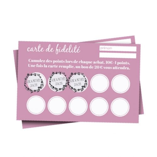
Here are some examples of business cards that also serve as a loyalty card:
To avoid:
- 2 different companies on the front and back. It is bad for your image and it mixes the concepts. Business cards are very inexpensive, so do not be afraid to tailor them. It will usually take 2 weeks to get your business cards, but always take some time to handle the unexpected.
- Avoid texts that are too close to the edges ... leave a margin for more elegance and air the text.
- Always ask for a PDF version before the draw, and ask people to re-read and validate their business card individually with a delay of 2 or 3 days to avoid typo errors (this happens very often on the business card). Generally, you have to use a shared Excel file (or Google Sheets) in order to always have the latest version online.
7) GRAPHIC CHARTER
The visual identity of your company is represented by a set of color codes, fonts, and layout that is called a graphic chart.
In order for your customers to recognize you, it is essential to use the same graphic charter for all your commercial documents.
To avoid:
- Logo in low definition.
- A different layout within the same company.
- The rainbow of colors and fonts.
- Logo in low definition.
- A different layout within the same company.
- The rainbow of colors and fonts.
The best is to ask your communication agency or freelance to decline your graphic charter on different media.
By respecting your graphic charter on all media, you will be able to give coherence to your image with your customers, prospects ...
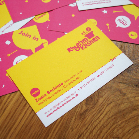
Here are some examples of declination of a graphic chart on several supports:
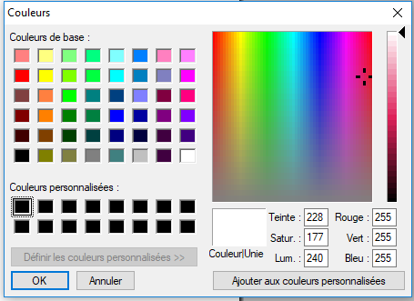
Also, remember that colors have a meaning: making a business card in red or yellow does not mean the same thing at all.
Here below is the color palette and the emotions associated with it:
In the same way, the choice of the shade of color is important, to avoid choosing colors "raw", and preferred nuances:
Thus a color can become a trademark, like Klein Blue.
8) POLICE
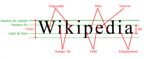
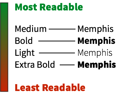
Think above all about readability! Opt for a simple font, with a minimum size of 7.5 pt and which respects your graphic charter.
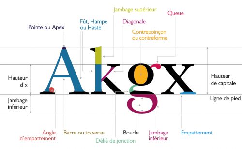
Regarding the choice of the font, the current trend is to have "round" fonts (sans serif) and not "square" fonts (serif):
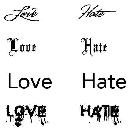
Indeed, unconsciously, the shape of the font sends a message:
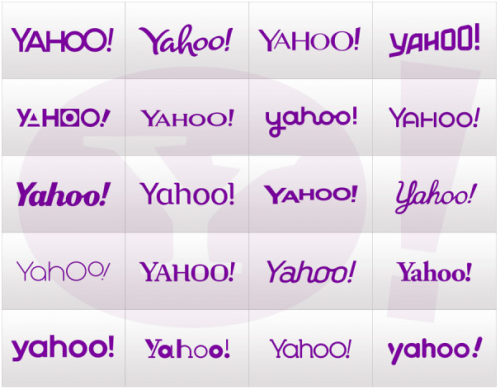
Here is the same word with the different fonts:
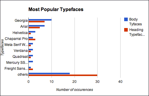
Ideally, you can opt for paid fonts, or even specific to your business, to no longer use the traditional Arial, Calibri, Verdana ...
Indeed one can very easily play on the different of a font to differentiate itself:
To avoid:
- You have many sites that offer paid fonts (fontshop.com, myfonts.com ...)- Do not use more than 2 or 3 different fonts, but do not put all the information to the same size. Put in bigger names of the company, the names and first names ...
- You have many sites that offer paid fonts (fontshop.com, myfonts.com ...)- Do not use more than 2 or 3 different fonts, but do not put all the information to the same size. Put in bigger names of the company, the names and first names ...
- The police "Comic", the calligraphies ... are to be banned because too "amateur" or too expressive.
CONCLUSION
Today, many options are available to beautify your business cards and so stand out from the competition.
For example, it is possible to print transparent, chromed, silver, gold, grain-like layer papers ... to opt for a square or round format, to use a varnish ... but it must be borne in mind that your business card must quickly inform its owner and not cause confusion.
If you do not feel the soul of a seasoned graphic designer, know that a simple business card but whose information is well organized will always have more impact than a card too complex which ultimately will disrupt the user.
Before you start printing your business cards, here are a few things to check:
- Does your business card give the image you want to give (eg serious, fun ...), and does it make you want to remember? Does your business card tell your story and your added value?
- In just 3 seconds and a simple wink can a prospect know what you are doing?
- Have you put all the essential information, while eliminating unnecessary information?
- Do the preferred means of contact appear first (eg email, phone, etc.)
- Do your business cards give you confidence?
- …
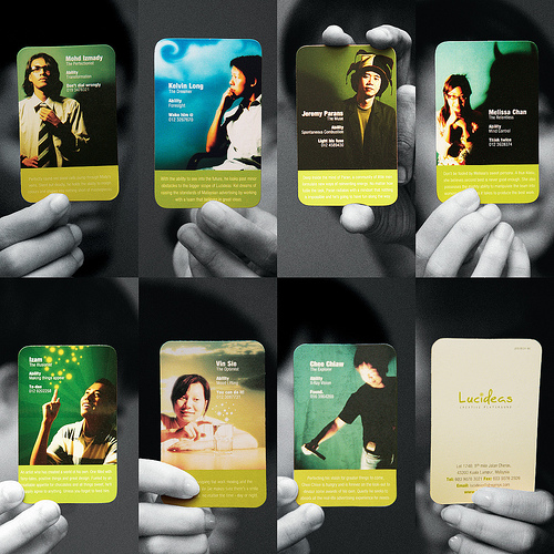
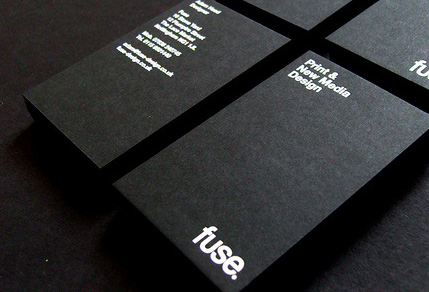
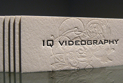
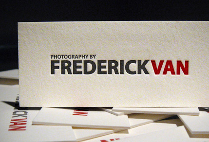
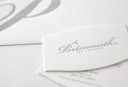
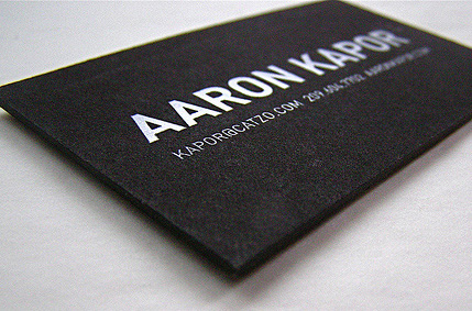
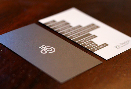
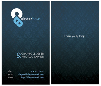
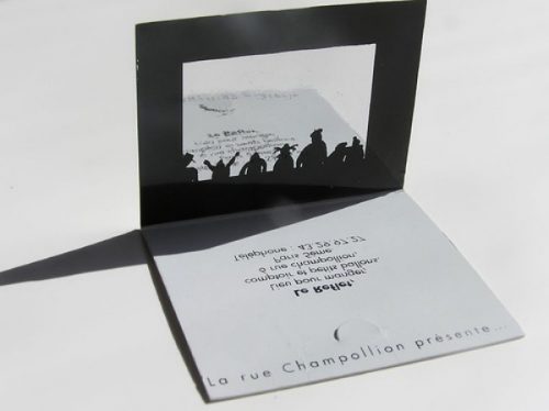
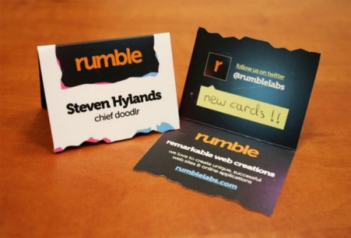
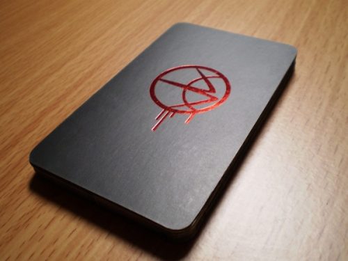
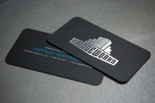
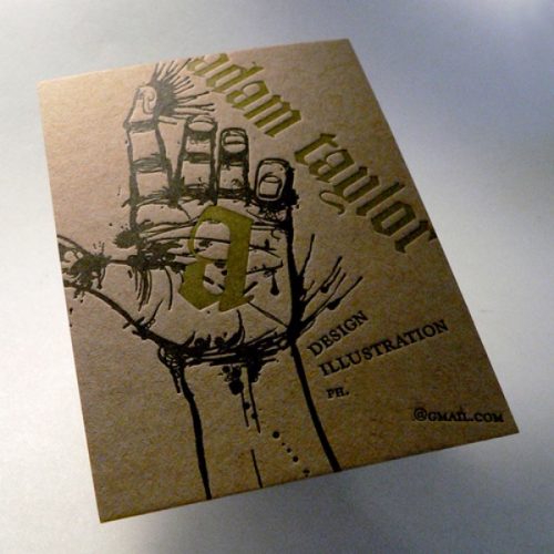
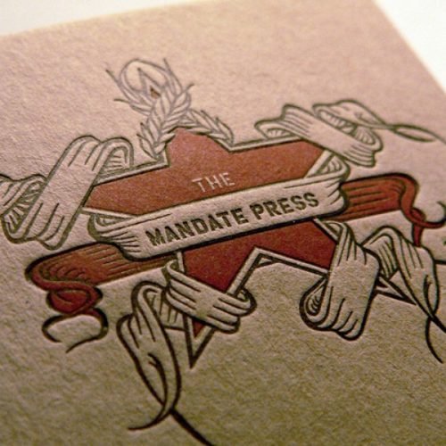
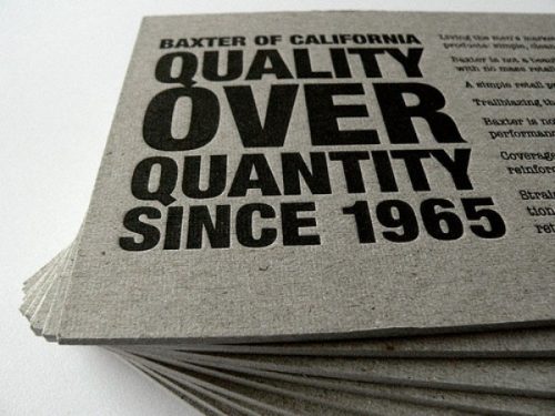
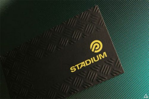
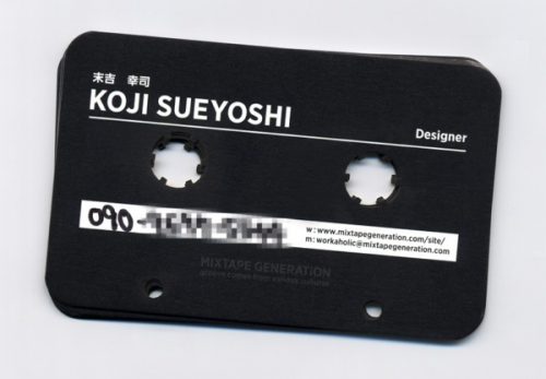
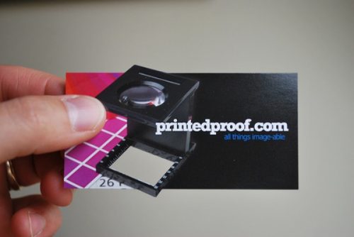
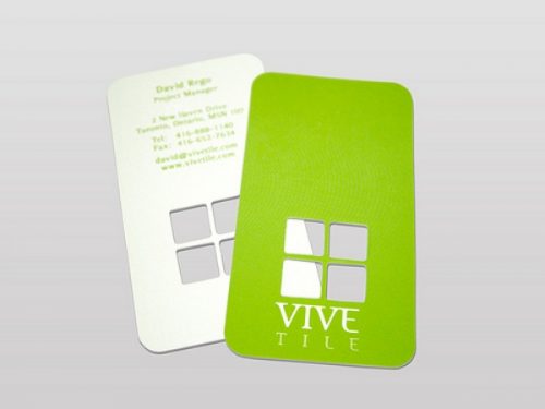
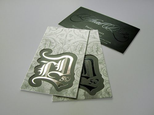
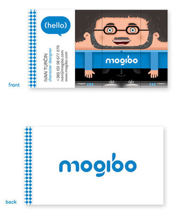
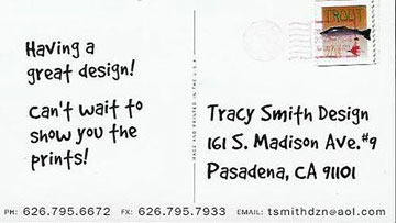
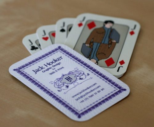
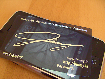
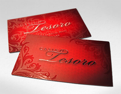
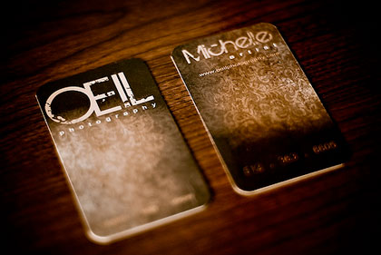
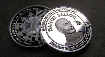
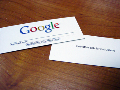
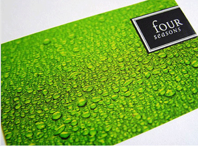
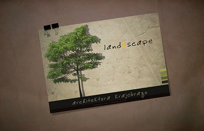
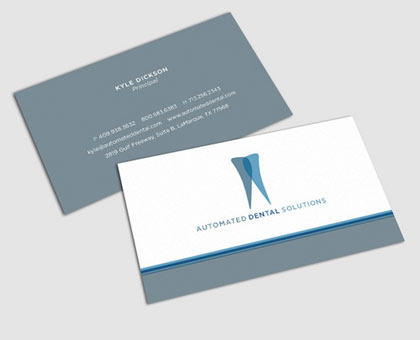
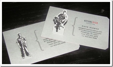
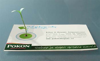
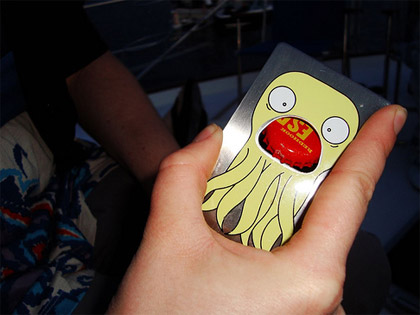
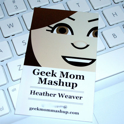
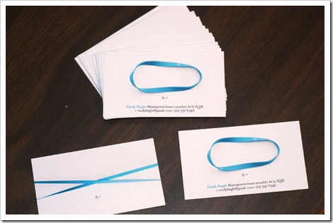
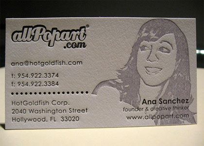
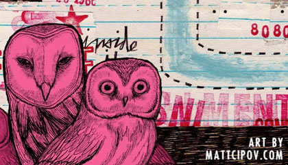
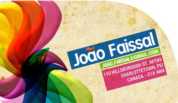
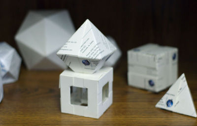
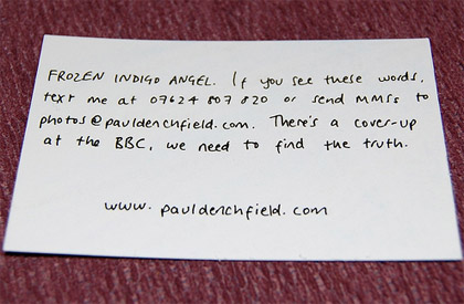
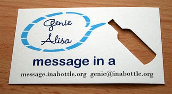
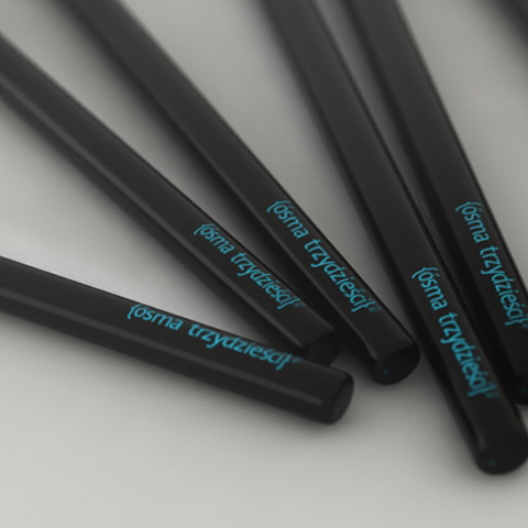
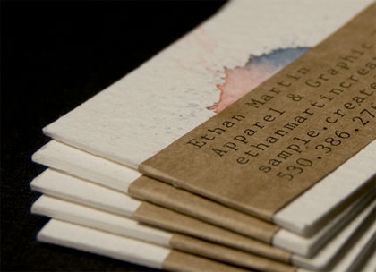
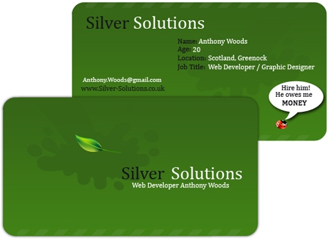
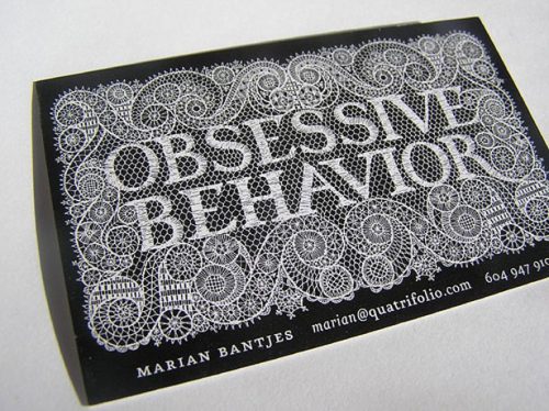
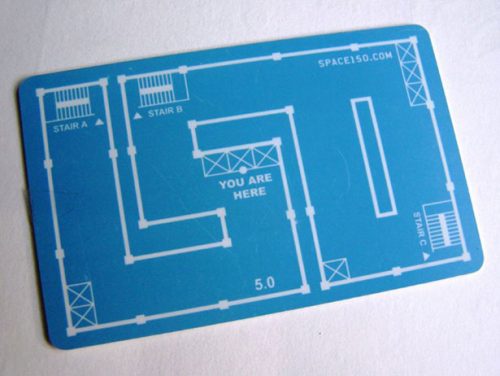
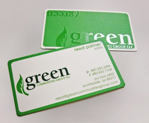
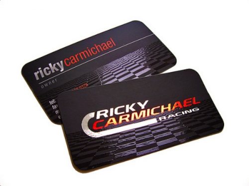
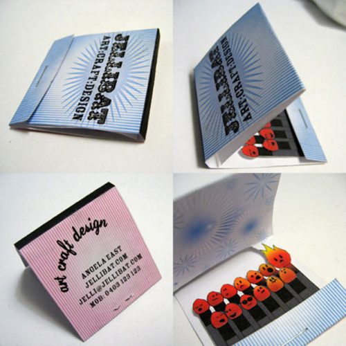
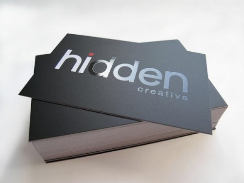
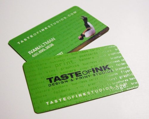
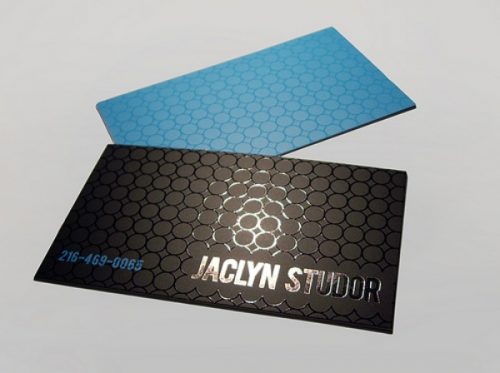
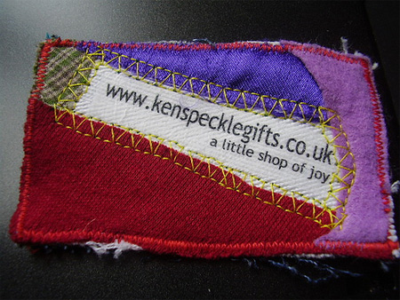
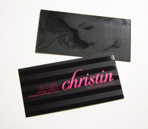
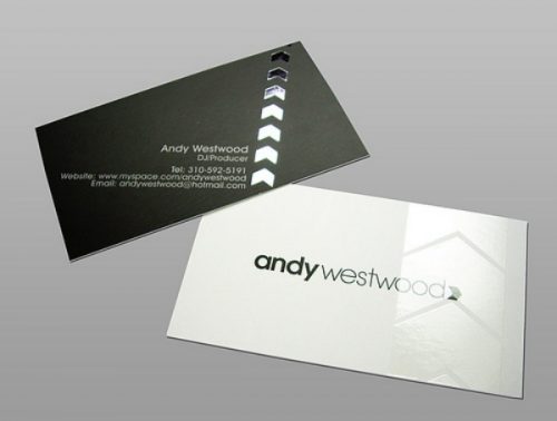
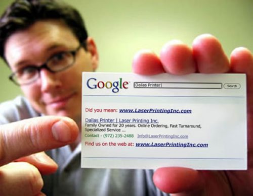
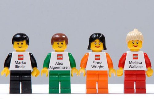
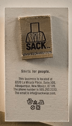
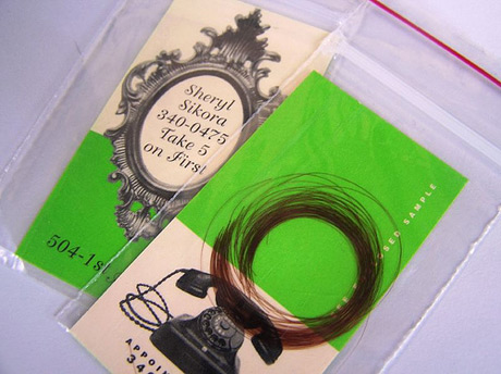
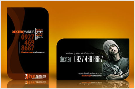
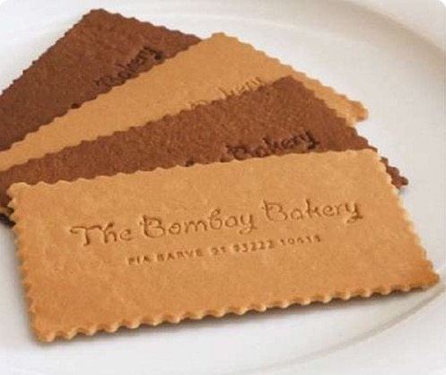
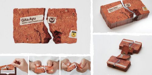
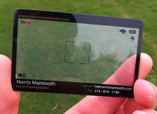
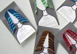
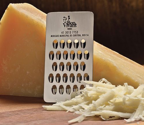
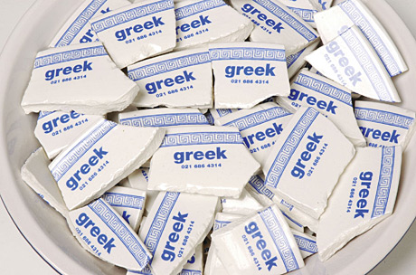
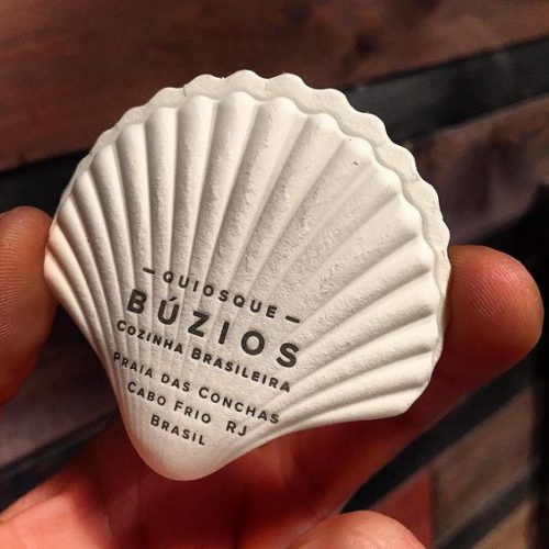
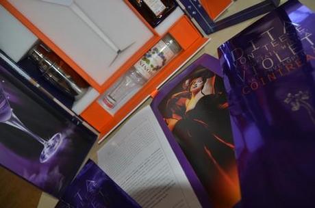
Here are 140 examples of business cards




















































Social Plugin